Tintin and the Adventure of the Influenced Artist
Thundering Typhoons: an exclamation of dismay.
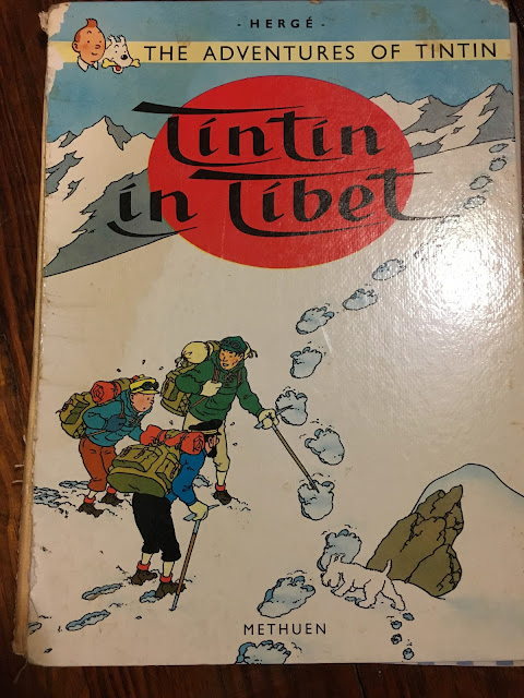
When I was a child one of my favorite things was Hergé’s Tintin series; I read these graphic novels over and over again till the books were falling apart. Tintin is a young reporter who has swashbuckling adventures, visits mysterious tombs and secret places, outwits bad guys, and ends up in chase scenes through exotic city markets all over the world. The first one I read was called Tintin in Tibet. By the time I was twelve I had read almost all of them. When I went off to art school and then became an artist, I forgot about Tintin, but ten years later I had kids of my own and I pulled them out again. The boys never got tired of hearing me read Tintin in funny accents and voices and it wasn’t unusual to hear one of them holler “Thundering typhoons” as they raced around outside on adventures. Now I’m thinking about Tintin not as great reading, but as great art.
The illustrations are striking. There’s a particular palette of colors I associate with Tintin, the compositions are very carefully considered, and the lines are almost always the same thickness and very clean (the ‘clear line’ style, no hatching or scratchiness). The buildings, cars, boats and machines are all drawn with great precision and realism, but the characters are drawn like cartoons, exaggerated, with big noses, skinny legs, and funny hair.
It wasn’t till years later that I realized how much Hergé had influenced my own work. I don’t write comic novels but I often use compositional elements that I first saw in Tintin. For instance, I love extreme perspective viewpoints, as if seen from a bird’s eye or a mouse’s vantage point. Hergé often uses that technique too. Here’s an example of a Hergé composition next to one of mine:
Hergé was such a strong draftsman that it’s really satisfying to comb through the pictures - there’s no end to the interesting detail in his drawings and he was quite deliberate about the details he chose to emphasize. I also focus deliberately on certain details in my work and leave most others out. Hergé loved to create wide distances between the foreground and background, I love to do that too.
Yet Hergé’s excellent technique is only the framework for his books; his characters, in all their quirky and hilarious variety, are the center of the show. There’s the blustery Captain Haddock, who shouts, “Blistering barnacles in a thundering typhoon!”whenever he’s upset, and Thompson & Thomson the blundering identical twin police officers (who aren’t really twins - only one of them has a ‘p’ in his name) who regularly say the wrong thing, fall down the stairs, or sit on their bowler hats. And of course Snowy, Tintin’s faithful dog and sidekick, who keeps up a running commentary, muttering to himself about what the crazy people are doing now.
As a child I just loved Hergé’s stories and drawings, and as an artist I’ll always owe a debt to his illustrations, but as a 21st century adult I have to face the glaring racial stereotypes, alcoholism, and violence that litter the Tintin books. Though the books are a product of their particular time and place, those problems and prejudices are, unfortunately, still alive and well today. We didn’t keep art like this from our kids, instead, we experienced it with them and used it to help them understand the sober attitudes and history underlying the funny characters and their adventures. The world isn’t a black and white place. Artworks like the Tintin books that mix up the good and the bad, tell us real things about ourselves and our world. There is value in being able to enjoy what’s good about them even as we evaluate and reject what is bad.


Comments
Post a Comment